Showing posts with label CSS. Show all posts

Custom Style All Your Form Elements with Pure CSS and No JavaScript


As a designer, being able to style every HTML element with CSS is what I desire, and not having to use additional scripts to do it is an even bigger desire. We already have a good amount of control over text, paragraph fields and submit buttons, but not much control over other form elements.

Custom Style All Your Form Elements with Pure CSS and NO Javascript

This article will show you how to style all form elements and cover which techniques work in which browsers.

Custom Style All Your Form Elements with Pure CSS

Like the title says, we're going to style the following elements with pure CSS and without any JavaScript help:
  • check boxes
  • radio inputs
  • select boxes
  • file upload inputs
  • text area
  • text fields
  • submit buttons
You will need to download this zip file for the element images.

First Things First

Your HTML tag should look like this:
<!-[if IE 7 ]> <html lang="en" class="ie7" > <![endif]->
<!-[if IE 8 ]> <html lang="en" class="ie8" > <![endif]->
<!-[if IE 9 ]> <html lang="en" class="ie9" > <![endif]->
<!-[if (gt IE 9)|!(IE)]><!-> <html lang="en"> <!-<![endif]->
This is Paul Irish's technique to target IE browsers without using hacks. This'll come in handy when we start coding. We're using HTML5, so make sure you have the HTML5 Shiv in your and reset your form elements like so:
input, select, textarea {
margin:0;
padding:0;
font-size:0.85em /* this is optional, I like the fonts a little smaller */;
outline:none;
font-family:inherit; box-sizing:border-box /* make sure you use the other vendor prefixes */;
}

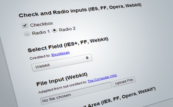
Check and Radio Inputs (works in IE9, FF, O, Webkit)

Let's get started with the check boxes and radio buttons. We'll need the element to precede the check box and radio inputs for this to work properly. Here's the markup:
<input type="checkbox" id="male" /><label for="male">Checkbox</label><br/>
<input type="radio" name="option" id="female" /><label for="female">Radio 1</label>
<input type="radio" name="option" id="female2" /><label for="female2">Radio 2</label>
Notice the "id" variables on the inputs match the for variables on the labels. This allows us to toggle the radio and check inputs by clicking the label itself, which is larger and easier to click with a mouse arrow or a finger. This is the way labels and input fields were intended to operate.
The CSS
This moves the browser's default radio and check inputs out of view:
input[type="radio"],
input[type="checkbox"] {
position: absolute; left: -999em;
}
Now we'll replace them by adding a pseudo element with a background image to our label element. We're adding a pseudo element instead of some padding and a background image to the label itself because the pseudo method allows us to use image sprites. Image sprites cut down on HTTP requests making the site load faster. For the check and radio inputs, I have two images: one for the off state and one for the on state. Each image is exactly 25 pixels by 25 pixels.
Here's the CSS with comments:
input[type="radio"] + label:before,
input[type="checkbox"] + label:before {
content:"; /* this is generated content*/
display: inline-block; /* make this fake elements inline block */
position:relative; /* we need to move the element without effecting the doc flow */
top:0.25em; /* we're moving it slightly down for alignment purposes */
left:-2px; /* we're moving it slightly to the left */
width:25px; height:25px; /* the width and height of the fake elements */
background-image:url(formelements.png); /* the background image sprite */
}
Now we have our images in place, but the background needs to be positioned. If sprites get complicated, you can always open them in your graphics program and measure the distance with a ruler and get the numbers that way. I keep my sprites simple and all the same size so they're easy to calculate in CSS:
input[type="checkbox"] + label:before { background-position: 0 -25px;} input[type="checkbox"]:checked + label:before {background-position: 0 0 ; }
input[type="radio"] + label:before { background-position: -25px -25px;} input[type="radio"]:checked + label:before { background-position: -25px 0;}
The second lines of code say: if the input has a :checked pseudo class, change the background position of the label's pseudo element that precedes it. As mentioned before, this technique only works when the label precedes the input element in the markup. You can learn more about advanced CSS selectors in this great Smashing Magazine article.

Browser Fallback

We want to support our IE7-8 users so we are going to remove the custom styling for these browsers because, while IE8 supports pseudo elements in markup, it doesn't support the pseudo :checked class, so our toggle won't work, and IE7 supports none of these techniques.
.ie8 label:before { display:none; content:none; /*this removes the fake content*/ }
.ie8 input[type="checkbox"],
.ie8 input[type="radio"],
.ie7 input[type="checkbox"],
.ie7 input[type="radio"]{ position: static; left:0; /* this puts the inputs back in their place */
}
For IE8, I noticed some weirdness in the alignment of the input and the label and so I fixed it. It could've been my IE Tester software, so this code is optional. Use and adjust it if IE8's input alignment looks wacky to you.
.ie8 input[type="checkbox"],
.ie8 input[type="radio"] {
position:relative; top:5px;
margin-right:0.5em;
}
[ demo link ]

Select Fields (Works in IE8+, FF, Webkit)

The credit for this technique belongs to: Bovotasan
The problem with select fields are those drop down buttons. There's no way of styling them, so what we can do is hide them. Basically, we'll wrap the select box in a div, make the select box longer than the div and make the div hide the access width of the select box (which is where the drop down button is). Then we'll apply a background image with our own drop down button. Here's the image we'll be using and the markup:
<div class="styled">
<select>
<option>Explorer</option>
<option>Firefox</option>
<option>Webkit</option>
</select>
</div>
Here's the CSS:
div.styled {
overflow:hidden; /* this hides the select's drop button */
padding:0;
margin:0;
background: white url(formelements-select.png) no-repeat bottom right;
/* this is the new drop button, in image form */
width:12em; border-radius:2px;
box-shadow: 0 1px 3px rgba(0,0,0,0.2);
border: solid 1px #ccc;
}
Now we remove any styling from the select box within in the div:
div.styled select {
width:115% /* this percentage effectively extends the drop down button out of view */;
background-color:transparent /* this hides the select's background making any styling visible from the div */;
background-image:none;
-webkit-appearance: none /* this is required for Webkit browsers */;
border:none;
box-shadow:none;
padding:0.3em 0.5em; /* padding should be added to the select, not the div */
}
This technique doesn't work in IE7, so you'll have to remove the styling from the div and apply it to the select box itself. Basically you'll have to fallback to standard styling for IE7. IE7 Doesn't support background images on select either. IE7 is the new IE6.
.ie7 div.styled {border:none; }
.ie7 div.styled select {
width:100%;
background-color:white;
border: solid 1px #ccc;
padding:0.3em 0.5em;
}

File Upload Field (Webkit only)

Adapted from but credited to: The Computer Whiz
Now the file upload field is the most difficult to style, but it is very customizable in Webkit. I originally had a method of creating an upload button and placing it on top of the default button using a pseudo element for Webkit only, but the Computer Whiz method is much better. When I came across it, I decided to use it, but with a few changes of my own. Here's the markup:
<input type="file" />The CSS
This styles the text box:
input[type="file"] {
position: relative /* this needs to be in place for the pseudo element to position properly */;
-webkit-appearance: none /* this is the key to clearing the default styling */;
width: 40%;
padding:0;
background-color: #f5f5f5;
box-shadow: inset 0 2px 3px rgba(0,0,0,0.2);
border:solid 1px #ccc;
}
This removes the default file upload button:
input[type=file]::-webkit-file-upload-button {
width: 0;
padding: 0;
margin: 0;
-webkit-appearance: none;
border: none;
}
This styles the upload file button, you can even change the wording.
input[type="file"]:after {
content: 'Upload File';
margin:0 0 0 0.5em;
display: inline-block; left: 100%; position: relative;
background: white url(formelements-select.png) no-repeat center left;
padding:0.3em 0.5em;
border: solid 1px #ccc;
-webkit-appearance: none;
box-shadow: 0 1px 3px rgba(0,0,0,0.2);
}
The Computer Whiz has knowledge of Webkit prefixes that I don't, so I began searching for an exhaustive list. Although this is a good page, I don't feel it's exhaustive. If you know of any other lists, please let us know. As Chrome has become the second most used browser, just behind Internet Explorer and passing Firefox, these extensions will come in handy when styling elements of any kind in Chrome.

Text Fields and Buttons (all browsers)

Most of us already know how to style these elements, but just in case you don't, here's the code. Of course the box shadows don't work in IE8 and earlier, so you'd either have to setup a conditional style or live without the special effects. I tend to go for the latter. Less code is better. Here's the HTML:
<input type="text" placeholder="Enter some text here" /><br/>
<textarea placeholder="Enter some words here" ></textarea><br/>
<input type="button" value="&laquo; Previous"> <input type="submit" value="Send &raquo;">
The CSS
For text fields and text boxes:
input[type="text"], textarea {
width:12em;
border-radius:2px;
border: solid 1px #ccc;
padding:0.4em;
background-color: #f5f5f5;
box-shadow: inset 0 2px 3px rgba(0,0,0,0.2);
}
With HTML5 forms can have new text attributes. The widely used ones are: telemail and number. These can be styled just as the input text field and can be selected using the below CSS:
input[type="tel"],
input[type="email"],
input[type="number"] {
Your styles here...
}
For submit buttons
input[type="submit"], input[type="button"] {
background: white url(formelements-select.png) no-repeat center left;
box-shadow: 0 1px 3px rgba(0,0,0,0.2);
border-radius:4px;
border: solid 1px #ccc;
padding:0.3em 0.5em;
}
Note: For newer CSS3, make sure to include the vendor prefixes for Firefox and Webkit/Android users still on Gingerbread 2.3.

Bonus: Making the form fields responsive

First of all, let's make the form fit the viewport on mobile devices. Put the following meta in the head of the document:
<meta name="viewport" content="width=device-width; initial-scale=1.0; maximum-scale=1.0;"/>The CSS
I keep my media queries in the same CSS file - right at the bottom. The following code says: If the view port is 600 pixels wide or less, change the body font size (which cascades) to 15 pixels. Because of mobile screen sizes, it's good to make the text a little smaller. The second query says: if the view port is 400 pixels wide or less, make the form elements' width 100%.
@media screen and (max-width: 600px) {
body { width:80%; font-size:15px; }
}/* end of query */
@media screen and (max-width: 400px) {
input[type="text"], select, div.styled { width:100% }
}/* end of query */

Conclusion

If you're having trouble with the media queries working in Firefox, depending on what add-ons/extensions you have installed to make Firefox better, these may prevent you from testing the responsive site. The solution is to disable your add-ons until you find the one that's causing the problem. Or it could be Firefox's menu bar: you might have to change the way it's displayed to resolve this issue.
read more

How to Slice Images into Tiles with jQuery and CSS3 Transitions


Did you ever wonder how those cool slideshow plugins split images into pieces and put them back together? This tutorial will get you a good understanding of the basic concept behind this effect as we build a simple jQuery plugin.

How to Slice Images into Tiles with jQuery and CSS3 Transitions

Check out the demo to see the tiles effect in action.

How to Slice Images into Tiles with jQuery and CSS3 Transitions

Project Setup

The first thing we need to do is to create a folder to hold our project. Let's name our plugin "sliced". Next, create three files,index.html,jquery.sliced.css and jquery.sliced.js. Grab this basic HTML template and copy/paste into index.html just so it's quicker to get started. Then download this image and put it in your folder. Now we're ready.
Let's create some initial markup:
<div class="sliced">
<img src="img01.jpg"/>
</div>
For the effect to work properly we need to set the dimensions of the container equal to the dimensions of the image.
.sliced {
position: relative;
width: 640px;
height: 400px;
}
Next, setup a basic jQuery plugin boilerplate:
;(function( $, window ) {
var _defaults = {
x : 2, // number of tiles in x axis
y : 2, // number of tiles in y axis
random : true, // animate tiles in random order
speed : 2000 // time to clear all tiles
};
$.fn.sliced = function( options ) {
var o = $.extend( {}, _defaults, options );
return this.each(function() {
var $container = $(this); // cache selector for best performance
// Code here
});
};
}( jQuery, window ));

How the Effect Works

The key to achieve this effect is background-position. Each tile is a div with the original image set as background and the background-position is calculated by getting each tiles' offset in relation to the parent container, using jQuery's .position(). Let's visualize it first:
You can fiddle with this CSS only demo to really understand how the effect works before abstracting the code.

Creating the Tiles

All the code from here on goes inside the return this loop.
First let's declare all the variables and elements that will be used to build the tiles.
var width = $container.width(),
height = $container.height(),
$img = $container.find('img'),
n_tiles = o.x * o.y, // total number of tiles
tiles = [], $tiles;
Next, we need to create all the wrappers for the tiles:
for ( var i = 0; i < n_tiles; i++ ) {
tiles.push('<div class="tile"/>');
}
$tiles = $( tiles.join('') );
// Hide original image and insert tiles in DOM
$img.hide().after( $tiles );
Now that the all tiles are in the DOM we can set the dimensions and the background:
// Set background
$tiles.css({
width: width / o.x,
height: height / o.y,
backgroundImage: 'url('+ $img.attr('src') +')'
});
// Adjust position
$tiles.each(function() {
var pos = $(this).position();
$(this).css( 'backgroundPosition', -pos.left +'px '+ -pos.top +'px' );
});
Finally float the tiles in jquery.tiles.css. This could be done in JavaScript but is better to keep our logic and styles separate:
.tile { float: left; }At this point if you call the plugin on the container and inspect the markup with the browser you can see that with so little code we already have a prototype that works. Here's the plugin so far.
$('.sliced').sliced({ x:4, y:4 }); // Split image in 16 tiles

Animating the Tiles

Every single tile needs to start animating at a certain point in time. For example, to animate 4 tiles in 2 seconds each tile needs to be animated for half a second and the delay will increase by half a second every next tile until all tiles have cleared.
We need to loop all tiles somehow; the first thing that comes to mind is a for loop . We could write something like:

var tile, i;
for ( i = 0; i < n_tiles; i++ ) {
tile = $tiles.eq( i );
}
The above approach is alright but it doesn't provide a way to randomize the order in which the tiles are chosen to be animated. So yes, it works, but it's not ideal.
After much experimentation I found a simple way to get a range of numbers in random order:
/**
* range Get an array of numbers within a range
* @param min {number} Lowest number in array
* @param max {number} Highest number in array
* @param rand {bool} Shuffle array
* @return {array}
*/
function range( min, max, rand ) {
var arr = ( new Array( ++max - min ) )
.join('.').split('.')
.map(function( v,i ){ return min + i });
return rand
? arr.map(function( v ) { return [ Math.random(), v ] })
.sort().map(function( v ) { return v[ 1 ] })
: arr;
}

With this little function you can pass a minimum and maximum value and it will return an array with all numbers in the given range. If the rand flag is set to true it will shuffle the array. Try it:
console.log( range( 0, 5, true ) ) //=> [ 0,2,5,3,4,1 ]Since this function doesn't depend on any jQuery code we should move it outside the plugin, at the same level where _defaults is declared.
Now that the tiles can be looped however we want let's use setTimeout to control the delays:

var tilesArr = range( 0, n_tiles, o.random ),
tileSpeed = o.speed / n_tiles; // time to clear a single tile
tilesArr.forEach(function( tile, i ) {
setTimeout(function(){
$tiles.eq( tile ).fadeTo( 'fast', 0 );
}, i * tileSpeed );
});
At this point if you try the plugin it will animate the tiles' opacity in random order as soon as the page is loaded but we want to have some control over this. This indicates the need for a public method. The simplest way to expose some code to the user is to create a custom event:
// Public method
$container.on( 'animate', function() {
tilesArr.forEach(function( tile, i ) {
setTimeout(function(){
$tiles.eq( tile ).fadeTo( 'fast', 0 );
}, i * tileSpeed );
});
});

Now when we call $('.slider').trigger('animate') the animation will begin.

Using CSS3 Transitions

So the basics are working, wonderful! but we want to have even more control. Instead of using fadeTo let's add a class to the tiles when they are animated, that way we can use CSS transitions with our new class. We'll use toggleClass() instead of addClass() so the effect can be toggled back and forth by just calling the animate method on a button for example.
$tiles.eq( tile ).toggleClass( 'tile-animated' );Now, create a very basic opacity transition in CSS. For brevity only the unprefixed properties are used but you'll need to add the appropriate vendor prefixes in production.

.tile {
float: left;
opacity: 1;
transition: all .3s ease-in-out;
}
.tile-animated {
opacity: 0;
}
Last but not least, we need to prevent the CSS3 transitions from animating on page load. To fix this we can add a class to the body of the document while the contents are loading and then remove that class once the DOM has finished loading. This code doesn't depend on the plugin so let's add it before the plugin.
// Prevent css3 transitions on load
$('body').addClass('css3-preload');
$( window ).load(function(){ $('body').removeClass('css3-preload') });
Then cancel the transitions in CSS:
.css3-preload .sliced * {
transition: none !important;
}

Note: Run the plugin on document.ready() and not on window.load() otherwise the fix won't work properly.

Conclusion

Thanks to CSS3 transitions the effects that can be achieved with this approach are almost endless. A whole new effect can be created with just a single line of CSS, for example transform: rotateZ(360).
If you want to see what's really possible check out jquery.tiles, a jQuery plugin I recently released that creates a slideshow with a bunch of cool effects using the technique shown in this tutorial.
Note: Browser support is wide, we're only using CSS so it should degrade gracefully. Since the plugin takes advantage of some ECMAScript 5 methods such as map and forEach browsers that don't support these will need a polyfill like es5-shim or similar. Jquery's $.map and $.each could also be used but the native methods look cleaner and can be chained.
read more

Create a Glossy Photo Effect with CSS3


More and more we find ourselves creating effects that would normally be done in design software like Adobe Photoshop, using just CSS. And more recently the new effects achievable with CSS3.

Create a Glossy Photo Effect with CSS3


In this tutorial I'm going to show you how to recreate this common effect of making a glossy image, by using some CSS3 gradients.
HTML Structure

<!DOCTYPE html>
<html lang="en">
<head>
<meta charset="utf-8" />
<title>Glossy Gradient Effect</title>
<link rel="stylesheet" type="text/css" href="css/reset.css" />
<link rel="stylesheet" type="text/css" href="css/style.css" />
<!--[if IE]>
<script src="http://html5shiv.googlecode.com/svn/trunk/html5.js"></script>
<![endif]-->
</head>
<body>
<div id="wrapper">
<div class="photo">
<img src="images/bag.jpg" alt="Bag">
</div>
</div> <!-- END Wrapper -->
</body>
</html>
CSS Styling
General
body {
background: #EDEFF4;
}
#wrapper {
margin: 30px auto;
width: 600px;
}
Styling the photo container DIV
.photo {
margin: 30px auto;
height: 401px;
width: 602px;
position: relative;
-webkit-box-shadow: 0 2px 10px rgba(0, 0, 0, .5), 0 2px 3px rgba(0, 0, 0, .5);
-moz-box-shadow: 0 2px 10px rgba(0, 0, 0, .5), 0 2px 3px rgba(0, 0, 0, .5);
-o-box-shadow: 0 2px 10px rgba(0, 0, 0, .5), 0 2px 3px rgba(0, 0, 0, .5);
box-shadow: 0 2px 10px rgba(0, 0, 0, .5), 0 2px 3px rgba(0, 0, 0, .5);
}
.photo img {
border: 1px solid rgba(255, 255, 255, .1);
}
Styling the :before pseudo element of the photo
.photo:before {
content: "";
position: absolute;
top: 0;
right: 0;
bottom: 0;
left: 0;
background: -webkit-gradient(linear, 0% 0%, 0% 100%, from(rgba(255, 255, 255, .15)), to(rgba(0, 0, 0, .25))), -webkit-gradient(linear, left top, right bottom, color-stop(0, rgba(255, 255, 255, 0)), color-stop(0.5, rgba(255, 255, 255, .1)), color-stop(0.501, rgba(255, 255, 255, 0)), color-stop(1, rgba(255, 255, 255, 0)));
background: -moz-linear-gradient(top, rgba(255, 255, 255, .15), rgba(0, 0, 0, .25)), -moz-linear-gradient(left top, rgba(255, 255, 255, 0), rgba(255, 255, 255, .1) 50%, rgba(255, 255, 255, 0) 50%, rgba(255, 255, 255, 0));
background: linear-gradient(top, rgba(255, 255, 255, .15), rgba(0, 0, 0, .25)), linear-gradient(left top, rgba(255, 255, 255, 0), rgba(255, 255, 255, .1) 50%, rgba(255, 255, 255, 0) 50%, rgba(255, 255, 255, 0));
}

Conclusion


Okay, so for this short mini-tutorial, we're going to be using a very basic HTML5 setup. With the least amount of things possible, for this effect wants to be achieved using mainly CSS. Therefore it's best practice to keep the HTML as clean and semantic as possible.
So apart from the page structure and wrapper, we basically have just one DIV element (with a class of photo) that we've stuck an IMG tag inside of.
That's it for the HTML! So let's get onto the CSS side of things.
First of all we'll just set up the page so that we can concentrate on the photo element. Here we are just adding a background colour to the whole page, and setting up the page wrap DIV.
Next step is style the containing div. So here we're specifying the height and width of the block element. This is the most important point in this step, that and setting the position value to relative. Everything else is purely for aesthetic purpose. Like the cool double box shadow around the whole image, and the 1px border.
Now the image looks good. But we're missing one thing, the gloss effect itself. That's the last step in this mini-tutorial.
Here's the most important step of the whole effect, we're going to style the :before pseudo element of the div. That way we can add the style of the glossy look over the top of the photo without having to add extra markup in the HTML side of things. That way it's more semantic. Here we're absolutely positioning this element over the photo (that's why it's important to set position: relative; in the step above), and we're applying some CSS3 gradients to the background of this new pseudo element.
Now I know that all those numbers might be quite scary looking for beginners. But they're basically all RGBa values (color values that we can apply opacity to) inside of "stops" for the gradients. So to describe what's happening .. we have 2 halves of the gradient, going from the TOP LEFT corner, to the BOTTOM RIGHT one. The first half goes from fully transparent all the way to 50% transparent white. The second half goes straight back to fully transparent (that's what creates the diagonal line) and stays that way.

Create a Glossy Photo Effect with CSS3

That's it for this mini-tutorial. Don't hesitate to hit me up in the comments if you have any questions or suggestions. I've put the whole end product up on Github, so feel free to come over and fork it!
I hope you enjoyed this tutorial, and found it useful.

read more
Blogger Template by Clairvo