More and more we find ourselves creating effects that would normally be done in design software like Adobe Photoshop, using just CSS. And more recently the new effects achievable with CSS3.
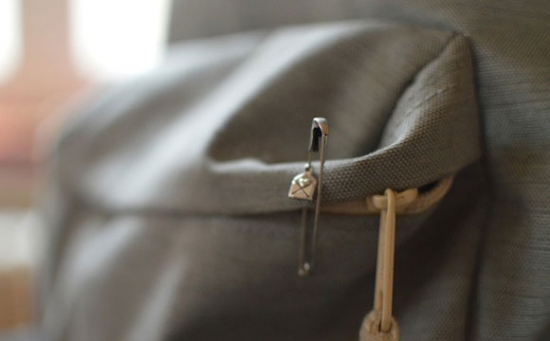
In this tutorial I'm going to show you how to recreate this common effect of making a glossy image, by using some CSS3 gradients.HTML Structure
<!DOCTYPE html>
<html lang="en">
<head>
<meta charset="utf-8" />
<title>Glossy Gradient Effect</title>
<link rel="stylesheet" type="text/css" href="css/reset.css" />
<link rel="stylesheet" type="text/css" href="css/style.css" />
<!--[if IE]>
<script src="http://html5shiv.googlecode.com/svn/trunk/html5.js"></script>
<![endif]-->
</head>
<body>
<div id="wrapper">
<div class="photo">
<img src="images/bag.jpg" alt="Bag">
</div>
</div> <!-- END Wrapper -->
</body>
</html>
CSS Styling
General
body {
background: #EDEFF4;
}
#wrapper {
margin: 30px auto;
width: 600px;
}
Styling the photo container DIV
.photo {
margin: 30px auto;
height: 401px;
width: 602px;
position: relative;
-webkit-box-shadow: 0 2px 10px rgba(0, 0, 0, .5), 0 2px 3px rgba(0, 0, 0, .5);
-moz-box-shadow: 0 2px 10px rgba(0, 0, 0, .5), 0 2px 3px rgba(0, 0, 0, .5);
-o-box-shadow: 0 2px 10px rgba(0, 0, 0, .5), 0 2px 3px rgba(0, 0, 0, .5);
box-shadow: 0 2px 10px rgba(0, 0, 0, .5), 0 2px 3px rgba(0, 0, 0, .5);
}
.photo img {
border: 1px solid rgba(255, 255, 255, .1);
}
Styling the :before pseudo element of the photo
.photo:before {
content: "";
position: absolute;
top: 0;
right: 0;
bottom: 0;
left: 0;
background: -webkit-gradient(linear, 0% 0%, 0% 100%, from(rgba(255, 255, 255, .15)), to(rgba(0, 0, 0, .25))), -webkit-gradient(linear, left top, right bottom, color-stop(0, rgba(255, 255, 255, 0)), color-stop(0.5, rgba(255, 255, 255, .1)), color-stop(0.501, rgba(255, 255, 255, 0)), color-stop(1, rgba(255, 255, 255, 0)));
background: -moz-linear-gradient(top, rgba(255, 255, 255, .15), rgba(0, 0, 0, .25)), -moz-linear-gradient(left top, rgba(255, 255, 255, 0), rgba(255, 255, 255, .1) 50%, rgba(255, 255, 255, 0) 50%, rgba(255, 255, 255, 0));
background: linear-gradient(top, rgba(255, 255, 255, .15), rgba(0, 0, 0, .25)), linear-gradient(left top, rgba(255, 255, 255, 0), rgba(255, 255, 255, .1) 50%, rgba(255, 255, 255, 0) 50%, rgba(255, 255, 255, 0));}
Conclusion
Okay, so for this short mini-tutorial, we're going to be using a very basic HTML5 setup. With the least amount of things possible, for this effect wants to be achieved using mainly CSS. Therefore it's best practice to keep the HTML as clean and semantic as possible.
So apart from the page structure and wrapper, we basically have just one
DIV element (with a class of photo) that we've stuck an IMG tag inside of.First of all we'll just set up the page so that we can concentrate on the photo element. Here we are just adding a background colour to the whole page, and setting up the page wrap DIV.
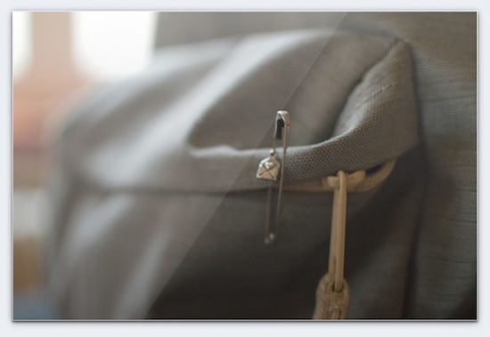
Here's the most important step of the whole effect, we're going to style the :before pseudo element of the
div. That way we can add the style of the glossy look over the top of the photo without having to add extra markup in the HTML side of things. That way it's more semantic. Here we're absolutely positioning this element over the photo (that's why it's important to set position: relative; in the step above), and we're applying some CSS3 gradients to the background of this new pseudo element.Now I know that all those numbers might be quite scary looking for beginners. But they're basically all RGBa values (color values that we can apply opacity to) inside of "stops" for the gradients. So to describe what's happening .. we have 2 halves of the gradient, going from the TOP LEFT corner, to the BOTTOM RIGHT one. The first half goes from fully transparent all the way to 50% transparent white. The second half goes straight back to fully transparent (that's what creates the diagonal line) and stays that way.
That's it for this mini-tutorial. Don't hesitate to hit me up in the comments if you have any questions or suggestions. I've put the whole end product up on Github, so feel free to come over and fork it!
I hope you enjoyed this tutorial, and found it useful.

0 comments: